Books have been written about the wild enthusiasm with which the architectural community approached the possibilities presented by cars in the twentieth century (1, 2, 3). None, though, have mentioned a gaping hole in one piece of their logic that doesn’t tally with their espoused claims about rationalization. Whether designing a town plan, a house, or any of the daily use items they would overhaul too, Modernists boasted of stripping everything back to essentials. Proceeding like Descartes from watertight axioms, they would build for us the post-enlightenment world.

One hypothesis was to spread out. Given the wildfire transmission of influenza in 1918, especially in cities, we can understand our forebears’ hunger for green space, fresh air, and sunlight.
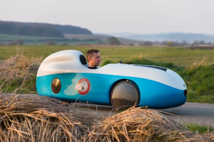
But another was to make that all happen using the car. The car can indeed help people spread out. However, it is not irreducible. As clever an invention as the car seems it does not capitalize on its driver’s own body for use as an engine. Instead, it has a heat and noise-making lump of cast metal on board. If you were to pair back the car’s design until no part was redundant, it would weigh less than its live payload and use that payload’s legs for propulsion. A rationalized car would be a bike, or maybe a trike, or a velomobile.

The enlightenment project of redesigning civilization along uber-rational lines was knocked off course by an axiomatic assumption that Socrates could have turned into mincemeat. If you want to move hay bales, attach a horse or a motor to your carriage, but if you aim to move flesh and blood engines—engines that last longer the more they are used—then reason dictates that those flesh and blood engines be put to good use.
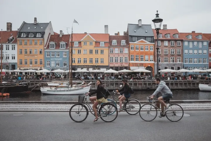
A century of sports-led advances in bicycle technology, coupled with practical innovations from bike transport nations like Denmark and the Netherlands, means we can now get across town more quickly by our own steam than we can if relying on privately owned machines with motors. Breakdowns, traffic snarls, and car parking woes always made driving a crapshoot. High-pressure tires, ergonomic design, and smoother transmissions have recently turned biking a breeze.

Yet we go on designing cities with cars as the centerpiece. Urban fringe subdivisions, retail warehouses out beside highways, internal lock-up garages, mountaintop getaways, junior soccer leagues that require away matches—decade by decade, car dependence underpins every design decision we make as a species, from highway investment to institutional structures, to the lengths of our raincoats.
Have you noticed how raincoats have become shorter? They used to come down past the knees. Our houses had more hooks than bedrooms, right at the front door, so every household member could still go to school, shops, and work when it was raining. These days, if we own a raincoat, it will most likely come to the waist and have been bought from a specialized camp store. Raincoats have become the kind of accouterment we associate with going hiking, from car parks to mountaintops, to satisfy ourselves that a world of internal access garaging has not made us soft.
Critics of sterile Modernist architecture—Charles Jencks, Tom Wolfe, Brent Brolin, Peter Blake, etc.—blamed the failures of Modernism on the logic employed. Cold rationality, they argued, left no room for the kinds of whimsical yearnings that make us human. But a whimsical yearning for motorized transport was at the heart of Modernist planning and the buildings, products, and systems of that planning approach. Modernism appeared rational, but deep down, it was giggling with excitement for whatever Henry Ford or Gabriel Voisin had in their showrooms. Look at the futurist poet Marinetti crashing his car and punching the air. Then see how Sant’Elia, the futurist architect, “endowed his imaginary machine-made metropolis with mythical attributes of speed” because, as Esther da Costa Meyer has written, “a certain naive technological determinism” pervaded Sant’Elia’s text.

How can we say cold rationality is to blame for the failures of Modernism when its avant-garde leaders were silly for cars? At a deep level, cold rationality was never really given a chance.
If we look at some of Modernism’s most famous failures, we will find auto-centric planning in the background. The social disasters at Pruit-Igoe and Hulme Crescent are commonly attributed to aerial streets cut off from the ground. But for the poor people living on those aerial streets, being cut off from the ground was not as bad as being cut off from opportunities available to wealthier citizens of their increasingly car-centric cities. The geographical isolation of those projects for the non-driving poor was as much to blame for the muggings as the cockeyed reasoning behind the floor planning.
Mies van der Rohe’s Farnsworth House stands now as a cautionary lesson to any architect who would strip a building of everything they thought was superfluous to need, like curtains or fly screens. However, what narratives of Howard Roark branded arrogance completely ignore, is that the house itself was superfluous to the needs of the client, Edith Farnsworth. She already had an abode. It was in the city and probably had curtains and fly screens.
The idea that every professional should also have a rural retreat is an idea that was being instilled, in those times, by car manufacturers, like General Motors. They funded the Futurama pavilion at the 1939 World’s Fair, a giant diorama showing freeways designed for 150mph jaunts to the country and back for fun. Whatever Mies designed for Dr. Farnsworth in that broader context would not need sunscreens, fly screens, insulation, curtains, or perhaps not even a roof. Viewed in the context of recreational car use, it was less of a house than a marker to show a driver where to turn around and head back.

If only we could turn back the clock to the mid-twentieth century! We would warn Le Corbusier about propagandizing for cars with his Villa Savoye, planned around the turning circle of his favorite Voisin. We would tell him to plan it around the turning circle of a Dutch bakfiets. We would tell Buckminster Fuller to build a Dymaxion bike. We would tell the whole avant-garde that their vision of a good life with cars was steering the world toward poorer health, congestion, wars, and greenhouse emissions.
It’s too late for that, though. It would be easier to get the whole world to speak Esperanto than to untangle our civilization from cars. Too many choices we make, about trivial things such as whether or not to let our children join soccer leagues, to things so profound as where we build housing, can be traced to a machine with two engines. The engine that wears out from use is the one that runs hot. The engine that lasts longer the more it is used is the one that sits idle. We’re stuck with cars, just as we’re stuck using English, with all its absurdities, as the world’s lingua franca.

But what if our cities had pockets of resistance, where cars were not the lingua franca of planning decisions? What if there could be urban districts where the default mode of transport was cycling, and design thinking proceeded accordingly? Albeit on a much smaller scale, the Modernist hypothesis that it’s good to spread out might live again, only coupled this time to a properly rationalized personal mobility device. I imagine zones within cities that, to enter, felt like entering China Town. From how they structured their lives and built environment to how they all dressed, everyone would be thinking on Bike.
Thanks for reading right to the end. I’m interested to know if any blog readers can join me in imagining purpose-built bicycling districts using a purely rationalistic epistemology.

